

5110
- 0
- Автор: pepelsbey
- Адаптировал: irbees2008
- Источник:
- Уровень сложности исполнения: это делается простым копированием и нажиманием кнопки

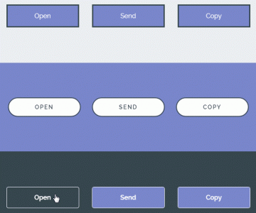
Сегодня показываю пример изменения кнопок чек бокса и радио кнопки.
1.Первый вариант это чекбокс ,вот сам HTML код нашей формы с чек боксом
Код:
<div class="switch">
		<input type="checkbox" checked="" id="switch-1" class="switch-check">
		<label for="switch-1" class="switch-label">
			Опция
			<span class="switch-slider switch-slider-on"></span>
			<span class="switch-slider switch-slider-off"></span>
		</label>
	</div>
Код:
/* Switch */
		.switch,
		.switch-label,
		.switch-slider {
			width:154px;
			height:54px;
			}
		.switch {
			position:relative;
			display:inline-block;
			margin:0 50px 50px 0;
			}
			.switch-check {
				position:absolute;
				opacity:0;
				}
			.switch-label,
			.switch-slider {
				position:absolute;
				top:0;
				}
			.switch-label {
				left:0;
				text-indent:-9999px;
				}
			.switch-slider {
				border-radius:27px;
		        box-shadow:
		        	0 0 0 2px rgba(0, 0, 0, 0.1) inset,
		        	0 0 4px rgba(0, 0, 0, 0.5) inset,
		        	0 5px 4px 1px rgba(0, 0, 0, 0.3) inset,
		        	0 27px 0 rgba(0, 0, 0, 0.07) inset;
				-webkit-transition:width 0.2s linear;
				-moz-transition:width 0.2s linear;
				-o-transition:width 0.2s linear;
				transition:width 0.2s linear;
				}
			.switch-slider-on {
				left:0;
				width:54px;
				background:#369AEE url(../images/on.svg) 100% 12px no-repeat;
				}
			.switch-slider-off {
				right:0;
				background:#FFF url(../images/off.svg) 86px 14px no-repeat;
				}
				.switch-slider-off:after {
					position:absolute;
					top:1px;
					left:1px;
					width:52px;
					height:52px;
					border-radius:50%;
					background:#E5E5E5;
					background:-webkit-linear-gradient(#D0D0D0, #FDFDFD);
					background:-moz-linear-gradient(#D0D0D0, #FDFDFD);
					background:-o-linear-gradient(#D0D0D0, #FDFDFD);
					background:linear-gradient(#D0D0D0, #FDFDFD);
			        box-shadow:
			        	0 0 2px 2px #FFF inset,
			        	0 0 4px 1px rgba(0, 0, 0, 0.6);
					content:'';
					}
			.switch-label:active .switch-slider-off:after,
			.switch-check:focus + .switch-label .switch-slider-off:after {
				background:#D5D5D5;
				background:-webkit-linear-gradient(#C8C8C8, #E4E4E4);
				background:-moz-linear-gradient(#C8C8C8, #E4E4E4);
				background:-o-linear-gradient(#C8C8C8, #E4E4E4);
				background:linear-gradient(#C8C8C8, #E4E4E4);
				}
			.switch-check:checked + .switch-label .switch-slider-on {
				width:154px;
				}
			.switch-check:checked + .switch-label .switch-slider-off {
				width:54px;
				}
Вариант два с радио кнопкой
1. Сам HTML нашей кнопки
Код:
<fieldset class="switch">
		<input type="radio" checked="" name="switch-1" id="switch-radio-off-1" class="switch-radio switch-radio-off">
		<label for="switch-radio-off-1" class="switch-label switch-label-off">
			Выкл.
			<span class="switch-slider"></span>
		</label>
		<input type="radio" name="switch-1" id="switch-radio-on-1" class="switch-radio switch-radio-on">
		<label for="switch-radio-on-1" class="switch-label switch-label-on">
			Вкл.
			<span class="switch-slider"></span>
		</label>
	</fieldset>
Код:
/* Switch */
		.switch,
		.switch-label,
		.switch-slider {
			width:154px;
			height:54px;
			}
		.switch {
			position:relative;
			display:inline-block;
			margin:0 50px 50px 0;
			padding:0;
			border:none;
			}
			.switch-radio {
				position:absolute;
				visibility:hidden;
				}
			.switch-label,
			.switch-slider {
				position:absolute;
				top:0;
				}
			.switch-label {
				left:0;
				text-indent:-9999px;
				}
			.switch-slider {
				z-index:2;
				width:154px;
				border-radius:27px;
		        box-shadow:
		        	0 0 0 2px rgba(0, 0, 0, 0.1) inset,
		        	0 0 4px rgba(0, 0, 0, 0.5) inset,
		        	0 5px 4px 1px rgba(0, 0, 0, 0.3) inset,
		        	0 27px 0 rgba(0, 0, 0, 0.07) inset;
				-webkit-transition:width 0.2s linear;
				-moz-transition:width 0.2s linear;
				-o-transition:width 0.2s linear;
				transition:width 0.2s linear;
				}
				.switch-slider:after {
					position:absolute;
					top:1px;
					width:52px;
					height:52px;
					border-radius:50%;
					background:#E5E5E5;
					background:-webkit-linear-gradient(#D0D0D0, #FDFDFD);
					background:-moz-linear-gradient(#D0D0D0, #FDFDFD);
					background:-o-linear-gradient(#D0D0D0, #FDFDFD);
					background:linear-gradient(#D0D0D0, #FDFDFD);
			        box-shadow:
			        	0 0 2px 2px #FFF inset,
			        	0 0 4px 1px rgba(0, 0, 0, 0.6);
					content:'';
					}
			.switch-label-on .switch-slider {
				left:0;
				background:#369AEE url(../images/on.svg) 100% 12px no-repeat;
				}
				.switch-label-on .switch-slider:after {
					right:1px;
					}
			.switch-label-off .switch-slider {
				right:0;
				background:#FFF url(../images/off.svg) 86px 14px no-repeat;
				}
				.switch-label-off .switch-slider:after {
					left:1px;
					}
			.switch-label:active .switch-slider:after {
				background:#D5D5D5;
				background:-webkit-linear-gradient(#C8C8C8, #E4E4E4);
				background:-moz-linear-gradient(#C8C8C8, #E4E4E4);
				background:-o-linear-gradient(#C8C8C8, #E4E4E4);
				background:linear-gradient(#C8C8C8, #E4E4E4);
				}
			.switch-radio:checked + .switch-label .switch-slider {
				z-index:1;
				width:54px;
				}
				.switch-radio:checked + .switch-label .switch-slider:after {
					visibility:hidden;
					}
Все выглядит красиво и работает,пользуемся.
Можешь почитать и вот эту статейку "Выводим Title не в news.full.tpl или news.short.tpl а именно в main.tpl"
Это тоже интересно
 21.09.14Немного о кнопках
 28.08.14Делаем стильные radio кнопки